Tuesday, July 31, 2012

Thrifty Furniture Finds

Last week my sister and I went consignment shopping in Bristol. We found a veritable gold mine of unclaimed wealth including a beautiful mid century modern coffee table that spins. It was in excellent condition and only needed a little TLC. The fact that it was made here in the good ol USA was a plus. My husband sanded and stained the wood surface in a darker shade. He added a polyurethane and wax finish for a protective layer. The cost of the coffee table was $70 + the DIY cost = $75 Not too shabby!

Mid Century Coffee Table @t Second Helpings, Bristol R.I

A few days ago, I stumbled upon a listing for a shabby chic accent table on Craigslist, a online resource rich in fine and fabulous furnishings. At $30 it was the perfect piece to compliment the Safavieh Lola Distressed Sideboard in our dining room. 


Shabby Chic End Table $30 via Craigslist
Safavieh Lola Distressed Sideboard $319 via Amazon

I love combining the past with the present. Pairing unlikely pieces together like a vintage coffee table with modern pillows gives the room a eclectic look on a budget.

So if you are looking for a way to stretch your dollar or go eco green by reusing or upcycling gently used furniture and decor, than check out your local consignment stores and thrift shops or browse the listings on Ebay and Craigslist. As always, keep an open mind and consider whether the furniture needs little or a lot of work to restore. Having a plan and taking the time to browse through the store will most likely make the trip a great success.


To me,there's no better feeling then coming across an awesome piece of furniture that really has a personality at an incredible price. Happy Hunting!

Thursday, July 19, 2012

The Cutting Edge

I've been using Osaka series knives to chop, dice, mince and peel just about everything. I bought them for cheap at Marshalls in a set that included a santoku and a paring knife. The duo has served me well over the years except age has started to show. A tinge of rust has settled over the beautiful stainless steel blade.  My non-brand name Chef's Knife will also need to be replace as it dulls far too quickly and does not have a comfortable grip.

After doing some research on cutlery, I found two brands that will meaningfully supplement all of my cutting needs. I also selected knives based on what my niece would enjoy using when she comes over and makes dinner. :)


Wusthof knives, a German brand world-renowned for their high quality cutlery offers knives that are made of high carbon stainless steel that will not stain, pit or RUST and will hold its edge. The unparalleled balance and sharpness makes Wustof the top choice by professional chefs. I looked at the different lines offered by Wusthof and went with the Grand Prix II because of their modern features including a molded pebble grain handle that provides nonslip comfort. The Grand Prix II is also more competitively priced than the Classic line. So I picked up the santoku with a hollow ground edge (5 inch) for $59.95 on Amazon. (I believe they have recently raised the price to $79.95) 


For more information on Wusthof knives click on the link.


The other well known brand is the leader in ceramic knives, Kyocera (Japanese). I have always seen ceramic knives at the store but not knowing much about them I never made a purchase. It turns out ceramic knives are actually sharper than stainless steel knives. The material used to construct the knives are the second hardest after diamonds. Ceramic knives are also light weight, never rust and are sanitary because the blade is very dense and not porous so there is also no odor. A high quality ceramic knife is also less expensive than a stainless steel knife of equal caliber. The fine craftsmanship produced is shown in this video. The only major drawback with ceramic knives is that they are breakable if not properly handled or dropped. So I intend to take extra care of these beauties.


Chef's Knife 7 inch $45.42 and Paring Knife 3 1/7 inch $13.00 via Amazon 

Monday, July 9, 2012

Shades of Gray

The elusive pale blue gray paint...finding the perfect mix has not been easy.

I know it's out there but I simply can't afford to pay $110 a gallon for it. Yes, I am talking about Donald Kaufman's DKC-37. An indescribable shade of blue gray that has a luxurious velvety quality to it. The subtle green undertone adds even more depth to the paint. The way different lights reflect off the surface is just awe inspiring. 

Again, $110. It also can't be duplicated because DK's paint uses as many as 13 pigments to create the subtle shades while most paint brands use only 3 pigments. The variety of colorants and their unique techniques in creating paint also means a copycat will most likely be inferior in quality. The numerous hues in each shade also react to changing light with much of the same richness and range of color found in the natural world. 

So while I can't afford the paint at least I am passed the stage between having identified what I want but I guess finding it is a whole nother story...

Ok.

Well this story includes numerous trips to Benjamin Moore over the course of 3 weeks. Numerous paint samples - that are now part of my scrap book collection. Than there are the strips of test colors on the wall which serve as a reminder to me and the hubby how radically different the paint swatch is in comparison to the actual paint. This is the sorta thing that will lead someone on an unhappy path that ends in frustration...

FYI: C2 paint swatches are actually made with their paint. So what you see is what you get. Unlike most paint companies, a swatch sample is computer generated and since there is no industry standard for this, one paint brand's robin egg blue is another paint's brand ducky blue. Yeah...wtf.

I could not accurately rely on the Internet as computer monitors render colors differently (based on the calibrations). Also the inspiring pictures with the paint colors - well they look different under different lighting. Sooooo....

I checked out the painters' forums and read reviews upon reviews. Yeah I did my research than decided I had to order a sample of Farrow and Ball. This company is said to make the best paint. I also picked up a sample of Pratt & Lambert's White Smoke and C2's Dorian Gray which turned out to be our absolute favorite. It isn't DK-37 but it gets high scores for being the right shade of gray and blue. It is soft and subtle which we really like. It just doesn't have the same depth but it is a high quality paint. C2 uses a 16 colorant European tinting system (similar to Farrow & Ball's) which produces higher solid content and a rich color vibrancy. 

I am almost sold on this color. It looks great during the day and at night under lamp light, it is almost a wispy kinda February winter day. Yanno with floating greyish clouds.

I think Dorian Gray will also work with Benjamin Moore universally appealing cloud white as a trim (a crisp white that doesn't look institutional) or with Farrow and Ball Pointing, a white that can only be described as a pillowy pile of buttery marshmallow.

Dorian Gray by C2


Wednesday, June 20, 2012

A Tale of Two Curtains


My top pick is the opaque Wood Block Circles cotton canvas panels with the embellish patterns. The canvas curtain panels allow natural light to filter through and the neutral color makes it easy to coordinate with the other fine furnishings in our home. The best part is the price! All sizes are on sale at West Elm starting at $19.99 per panel.


My second favorite is the Moderna Natural Crewel curtain panel made from a faux linen. It has an embroidered brown pattern with a earthy nature design. It looks elegant but the quality is questionable with mix reviews from buyers on Overstock.com. Price wise it is comparable to the West Elm window panels.

I am leaning more towards the curtains from West Elm but because they are not returnable, I have to be absolutely sure they will work with our windows. 

Color My World


A bunch of branch colored pencils in a handmade box made my day. One of the nifty finds I found at Home Goods today. 

Monday, June 18, 2012

Coffee Table Edition

My dream coffee table is the Ty Pennington round metal and glass table with rubbed bronze finish by Howard Miller. It's the perfect size (20" X 40" diameter) for our over sized sectional and it combines everything I want in a coffee table - the metal frame, glass and hard surface combination. There is ample storage space for our magazines and photo albums. The quality and craftsmanship is unsurpassed. However, the price is about $300 over our budget. 


$621.60 - Ty Pennington Round Metal Glass Table via Amazon.com
I did find some lovely alternatives. These moderately scaled contemporary metal round tables have a similar look with smooth clean lines and a art decor, mid century inspired design. They are sturdy and attractive. A few feature the glass and hard surface combo but so far none of them can compare to the Ty Pennington. My other alternative is to choose a rectangular shape coffee table but a round shape table is more ideal because it creates a sense of flow and provides contrast to the rectangular shapes in our living room. 
$49.99 - Vittsjo coffee table via ikea 
Wood and Glass combo. Made with tempered glass which is more durable but the size is too small. 
$142.99 - Round Glass Top Coffee Table via Overstock.com
Minimalist design but does not offer any storage space

$399 - Foxed Mirror Coffee Table via West Elm

Smoked glass surface with minimalist design. Simple and beautiful but not storage space


$294 - Hammary Nueva Round Cocktail Table in Aged Copper

via. Wayfair.com
Like the Ty Pennington is has a beautiful bronze finish. 
$399- TFG Martini Coffee Table with shelves in Java Oak via Mayfair
My second favorite coffee table. It does not have the glass surface but still feels airy. 

Wednesday, May 30, 2012

The Perfect Palette

In our pursuit to find the perfect shade of blue, the hubby and I played with a few paint colours. My personal fave, Pale Smoke from Benjamin Moore is a smoky shade of blue that is cool and light. It has subtle hints of grey. It also perfectly compliments Province Blue (an accent colour I adore). Our second round pick is Wales Gray (also available at Benjamin Moore) has a lightly colored stone facade with a bluish green cast. Both paint colours work well for our living room and dining room. The cooler colours really create a space with an expansive feel (ideal for our open floor plan) and a restful atmosphere. As homebodies the serene palette is very comforting. 


Sunday, May 20, 2012

Inspiration Boards


Inspiration boards courtesy of Young House Love


Wednesday, May 9, 2012

My posterior is very pleased with the new sectional sofa we ordered from Cardi's. The immeasurable comfort it provides makes me forget all about the frumpy futon we had to sit on while we waited for the new sofa to arrive. We originally had a tufted leather sofa but it was way too small for us (me, the hubby and our precious pooch, Prince). We considered adding two sitting chairs to the living room but after our leather couch ripped at the seams, we decided to trade it in for a new sectional sofa. The contemporary look and the extra seating space was exactly what we needed for the living room.

Monday, April 30, 2012

Airy Greenness

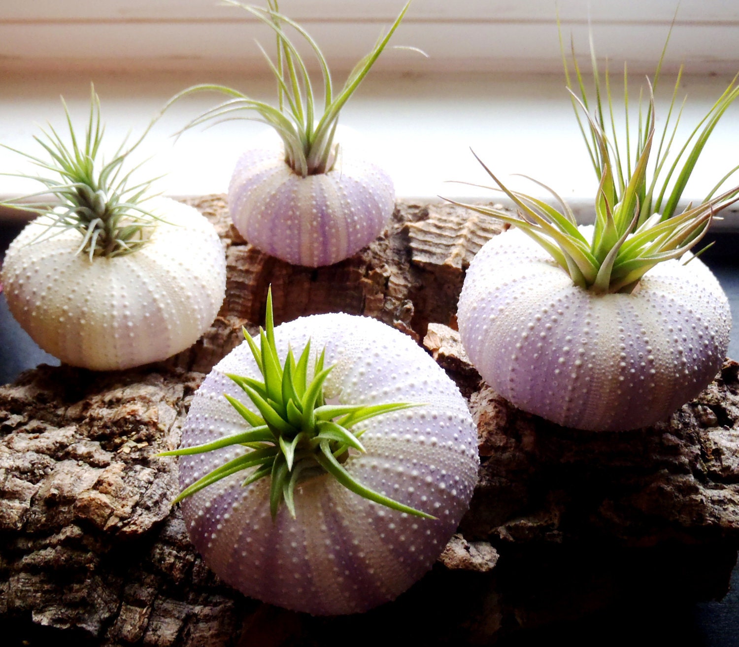
I am a selective green thumb, which means I work well with low maintenance plants like cactus, succulents (because they require little water) and tillandsia aka air plants. Air plants are epiphytes, a unique type of plant that absorbs water and nutrients via the air through their leaves instead of the roots. Part of the reason why they are so whimsy and wonderful. I am hoping to add a few of these little green beauties to our home. They are a great addition to my mini terrarium collection too. I am particularly fond of the Tillandia plants in the sea urchin shells below.


Jelly Fish Style via Etsy


Tillandsia urchin planters via Etsy

Thursday, April 26, 2012

Down with the Wall

Currently the house is less of a mess...The Chea boys (my husband and his cousins, brothers T & T) demolished the wall and my dreams of a floating wall. There will be a breakfast nook/bar instead - the mister's idea. Hubby is loving the easy living and spacious feeling of the open floor plan. He really likes the idea of being able to watch me cook from the kitchen too. Men...*roll eyes*

Wednesday, April 11, 2012

Style Quiz

While trying to figure out our decorating style, I stumbled upon Sproost, a unique online home design website that helps you define your style with a quiz. They also have a style engine that finds beautiful pieces of furniture, art work and decor online and in stores. The results highlight 3 general styles. It turns out the hubby and I are both Rustic Revivals. I ranked second in French Eclectic while the hubby came in second with Modern Elegance. We both come in 3rd in cottage chic minus the flowery patterns and wicker baskets. So our style is a unique fusion that mixes the old with the new. Think light airy rooms, clean lines, contemporary furniture, soft colors on the walls, modern designs mixing textures and prints along with a few vintage finds. A balanced look that is warm and inviting!


Saturday, April 7, 2012

Renovation Revolution

Interior design is sorta like blogging. Both are creative outlets. Both require a mix of inspiration and motivation. As a person who loves to test the artistic waters, the chance to renovate, design and decorate our living space is very exciting. It is also a great deal of work since the home renovation projects are all DIY or in our case DIO (Do It Ourselves). Lucky for us, we have super supportive family and friends who are more than willing to lend us a helping hand. Thanks to youtube, interior design and furniture blogs like Apartment Therapy and Design Sponge for providing the best resource guides, decor tutorials, top trends and tips on home design in a modern world.

We are inspired! And we are so ready to divide and conquer our two family home with the new plans! I will definitely continue to update with photos as we move along with the projects.

First off a fresh coat of paint does wonders! It's an inexpensive way to upgrade our old home with a new clean and bright look. We are still in the painting phase as we have 6 rooms to complete. Our living room, bedroom and office embraced the warmth of Macadamia by Martha Stewart. It is an earth tone shade of yellow that compliments our rich brown furnishings.

Next we are removing the old linoleum floors in the kitchen and dining room upstairs. We are replacing it with an off white ceramic tile with a cloudy grey design. The walls will be painted in Stone White by Benjamin Moore. The dining room and kitchen floors downstairs will be replaced with bamboo laminates because we also plan on putting them in the living room instead of refinishing the original hardwoods. The old 70s wall tile in the dining room and kitchen downstairs will be painted too. Still not sure about the color but now that the hubby wants to knock down the wall separating the dining room and kitchen for an open floor plan, I have to rethink the design and layout of the entire space. I am not so thrilled about the idea as I like defined living quarters. I like to eat in my dining room, entertain in my living room and work in my office. However I have found a architectural compromise. A dividing wall is a smart design solution that gives the feel of an open floor plan but the look of a defined space.

Thursday, March 29, 2012

Trader's Joe Easy Peasy Chicken Dish


Thanks to Pinterest for this simple and easy chicken recipe! This is a modified version from "The I Love Trader's Joe Cookbook". It requires little prep time which makes it perfect for the busy cook.

Ingredients:
1. A package of Chicken thighs (I used boneless, skinless thighs)
- You can make this recipe using chicken breasts, boneless pork chops or any meat you fancy. The cook time will vary so I suggest using a meat thermometer to make sure the meat is fully cook.
2. Rice Wine Vinegar 1 tablespoon
- Rice vinegar can be used as a substitute
3. Maple syrup 1/4 cup
- Try not to use the generic stuff as the flavors are more intense with the real deal. No offense Mrs. Buttersworth
4. Dijon Mustard 1/2 cup
- I hate mustard but I buy grey poupon for Pepe aka the hubby
5. Fresh Rosemary (optional)

1. Preheat oven to 450ºF
2. Prep your oven proof baking dish by lining it with aluminum foil
3. Salt and Pepper chicken thigh to your liking and place in baking dish
4. Mix the mustard, maple syrup and rice wine vinegar together than pour over chicken thighs
- don't forget to save a little of the sauce for later
5. Fully coat the thighs with the sauce
6. Put chicken thighs in oven to bake for 40 minutes or until the meat thermometer reads 165ºF. Baste the top of the chicken with more sauce half way through.
7. Bake for 40 minutes or until meat thermometer reaches 165ºF
8. Let Chicken rest for 5 minutes, spoon over some of the sauce and sprinkle fresh rosemary before serving.

I am not a fan of mustard so I was reluctant to try this recipe. However, my taste buds did not detect any mustardness. Instead there is a subtle sweetness and a savory flavorful taste to the tender chicken which makes it quite a palette pleasing dish.

A Tale of Two Blogs

I've decided to revive the old bloggity blog by breathing new life into it with my mad musings about every day life. This blog is and was always about my personal journey while my other blog was dedicated to my adventures in wedding planning. It just makes sense to pick up where I last left off.

Hello again, it has been a long, long time coming...xoxo